America is a big place. If you’ve ever driven around the country, you know it’s not a journey that should be embarked on carelessly. (Choose those podcasts in advance, people!) One poll even found that 11 percent of Americans surveyed had never left their home state. But according to a recent study out of the University of Illinois, even if you have never traveled around the United States, the food you eat (or at least elements of it) certainly has—and researchers finally compiled all this information in a high-resolution map so we can better comprehend the path foods take from the farm to our tables.
“People love maps!” principal investigator Megan Konar, an assistant professor of civil and environmental engineering, told me (very accurately) via email. “Now that we have a map of our national food supply chain we can visualize and appreciate it.”
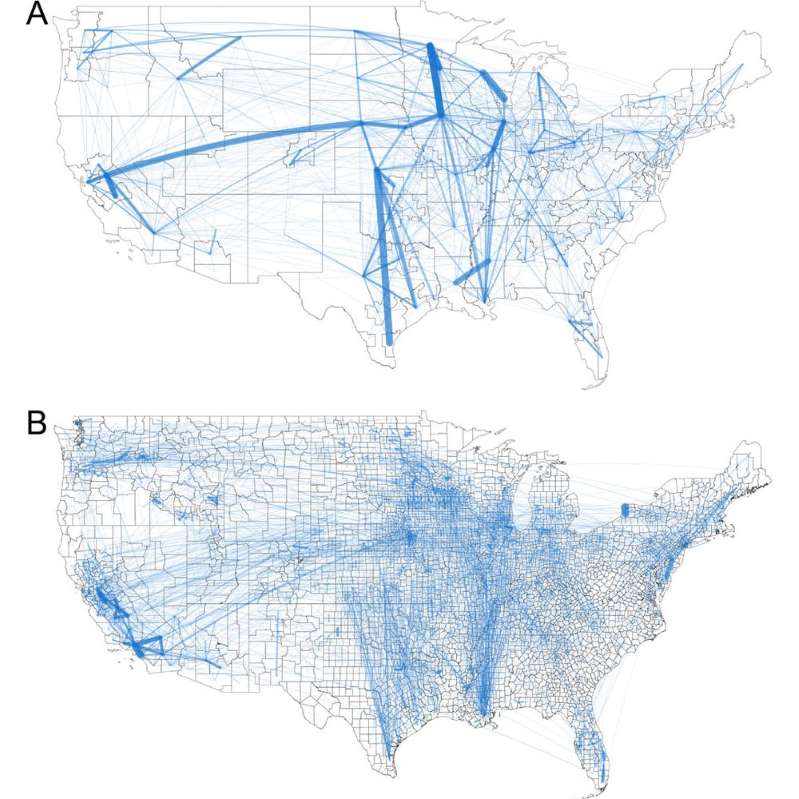
To create their map, the researchers developed what they called the Food Flow Model which “integrates machine learning, network properties, production and consumption statistics, mass balance constraints, and linear programming,” according to the paper. The team combined information from eight databases—including things like freight routes—to see how America’s 3,142 counties and county-equivalents were linked together by food supply chains. In the end, the map includes 9.5 million links.
But within those millions of links, larger patterns do emerge. “At over 17 million tons of food, Los Angeles County received more food than any other county in 2012, our study year. It shipped out even more: 22 million tons,” Konar wrote in an article for The Conversation. “California’s Fresno County and Stanislaus County are the next largest, respectively. In fact, many of the counties that shipped and received the most food were located in California. This is due to the several large urban centers, such as Los Angeles and San Francisco, as well as the productive Central Valley in California.” Of the top ten “Outflow” counties, only one was from outside of The Golden State: Maricopa County, Arizona. Meanwhile, the list of “Inflow” counties was more diverse, also including Erie County, New York; Cook County, Illinois; Douglas County, Nebraska; and Sussex County, Delaware, in the top ten. (It’s important to note that the data only looked at one year, 2012, and may have looked different in different years.)
But though this research showed the importance of border counties like Niagara County and port cities like New Orleans, it also found that plenty of movement happens within individual counties, too. “This is because of moving food items around for manufacturing within a county—for example, milk gets off a truck at a large depot and is then shipped to a yogurt facility, then the yogurt is moved to a grocery distribution warehouse, all within the same county,” Konar wrote.
But for the general public, the mapping tells a larger tale. “I hope the main takeaway for most people is the realization that we are all connected,” Konar told me. “Urban consumers and rural producers rely on one another and are intermediated by food processors and distributors. Americans are interconnected through our expansive food supply chain, which relies on critical and interconnected civil engineering infrastructure.”
Speaking of which, she also hopes her team’s research can improve this infrastructure, potentially improving the supply chain in the future. “Right now, our nation’s civil engineering infrastructure has a grade of ‘D+’ from the American Society of Civil Engineers (ASCE),” she continued. “I am confident that this work and research that builds on it will help us to understand how we can most effectively prioritize investment in our nation’s critical food supply infrastructure.”